Stage Apartments
Stage is a residential building project in the heart of Downtown Los Angeles. Designed by the internationally-renowned architect ByoungSoo Cho, Stage offers a tasteful and environmentally-respectful place where one can relax, and be herself in the presence of like-minded people.
Strategy
We started by discovering the noble purpose of the brand. Then, we created a detailed tenant persona to understand the psychology of the brand’s community. By understanding his/her needs, yearnings, and fears, we crystallized the brand’s promise.
Finally, we created an unmissable personality that would distinguish the brand from the competition, by giving it a unique tone of voice. Together, the purpose, promise, and the personality formed the Brand Platform of the new residential building project.
The Name
Why ‘Stage’?
We used the Brand Platform as a guide and a filter while working on naming. Our goal was to come up with a metaphor, which would truly represent the vision and the promise of the project. Our two key criteria were the easiness to remember and potential for smart visual depiction.
Among dozens of meticulously-created options, ‘Stage’ became the winner. To infuse meaning into the name, we wrote the following brand manifesto.
Brand Manifesto
“Life is a drama, and we are all actors in it. Nowhere the spotlights shine brighter on us than at our home. That’s where our dramatic passions and drives are in full display. House is a physical space; home is a feeling. Home is the place, where we showcase our way of life, our values, our yearnings. Home is the venue, where we receive support and gain strength. Home is the stage, where we make our dreams come true. This place is built in your image. Experience urban life at its best. The Stage is yours.”
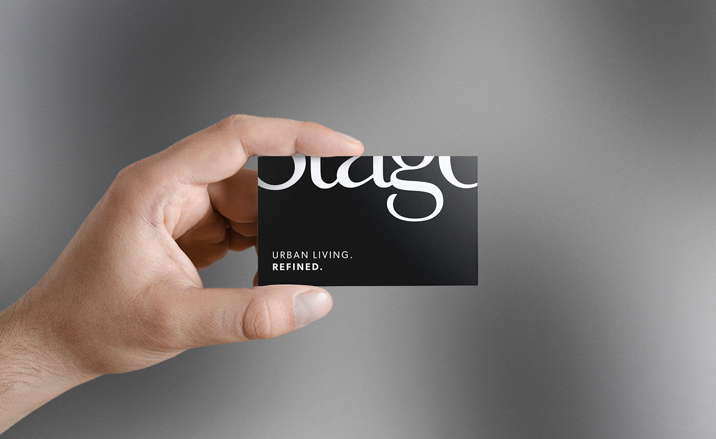
To complement the name, we came up with a tagline, which clearly and emphatically states the brand’s mission, ‘Urban Living. Refined’.
Logo
With the Brand Strategy process, we defined what Stage stands for, discovered how it can stand alone, and created the infrastructure for the answer to the question, ‘how will it stand out?’. The answer would be complete once we design the visual identity of the brand.
The logo had to be simple yet smart, elegant and modern but timeless. We designed 9 unique logo design options based on those qualities.
Each option highlighted a different characteristic of the brand, but they all shared the same strategic approach.
The winner has been the one below, which is inspired by the location of the property, 8th Street. Because of the subtleness of the modification of the letter, and also the fact that ‘Stage’ is a popular, generic word, ‘8’ transforming to ‘S’ didn’t affect the overall legibility. We made ‘Stage on 8th’ just ‘Stage’ with that twist.
Brand Style Guide
Once the logo is approved, we created a Brand Style Guide that sets the rules for the usage of the visual identity with elements such as lock-ups, colors, fonts and ways to avoid wrong usage. This guide helps the internal team and 3rd party business partners - such as printers - use the logo and the design elements properly and consistently.
Stationery
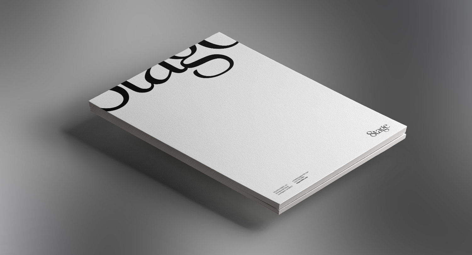
Following the logo design and the Brand Style Guide, we came up with a basic Stationery Set including business card and letterhead.
Teaser Campaign
For the teaser campaign, we came up with a series of posters to be presented on the streets of Los Angeles. Inspired by the creative nature of the potential tenants of Stage, the posters focus on design, photography, fashion and dance.
“Ozan and his team were extremely helpful from start to finish. They worked to ensure that they understood every aspect of the business before putting pen to paper. They are extremely responsive and timely.”
JAMES CHANG Co-founder / Stage Apartments


