Medutopia
Medutopia is a medical education company that aims to make educators better at what they do with high quality courses and inspiring methods. Their motto is 'reinventing medical education'. The name 'Medutopia' is a combination of the words 'medical' and 'utopia', representing their quest for the ideal medical education.
Logo
In the creative brief that we composed together with the client, two main concepts came up, which were 'Utopia' and 'Fun'. The client wanted to underline the 'Utopia' concept and requested the visual identity to make the audience feel the fun aspect, as it is an integral part of the courses they host.
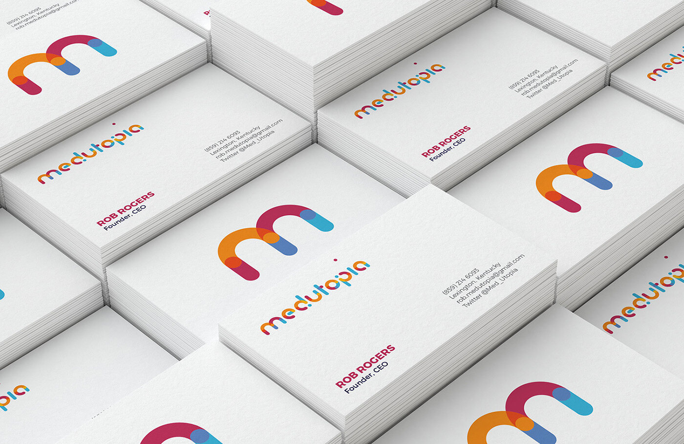
Among 10 unique designs, this one became the official logo of Medutopia:
Visualizing 'Utopia' in a 'Fun' Way
‘Utopia’ is an abstract concept. Past attempts to visualize it mostly picture an imaginative atmosphere with a futuristic cityscape with flying cars, unique structures, vivid colors and a bright sky. For Medutopia's utopia, however, that wouldn't be a relevant visualization. The second most understandable way of expressing the utopia concept could have been along the lines of going up, reaching for the top and being above everything.
We visualized this idea in a very subtle way by levitating the dot of the letter 'i' in Medutopia. We also took the colorfulness of the classic world of utopia, and also used that to emphasize the 'fun' aspect of the brand. That's how the Medutopia logo took shape.
The Medutopia Font
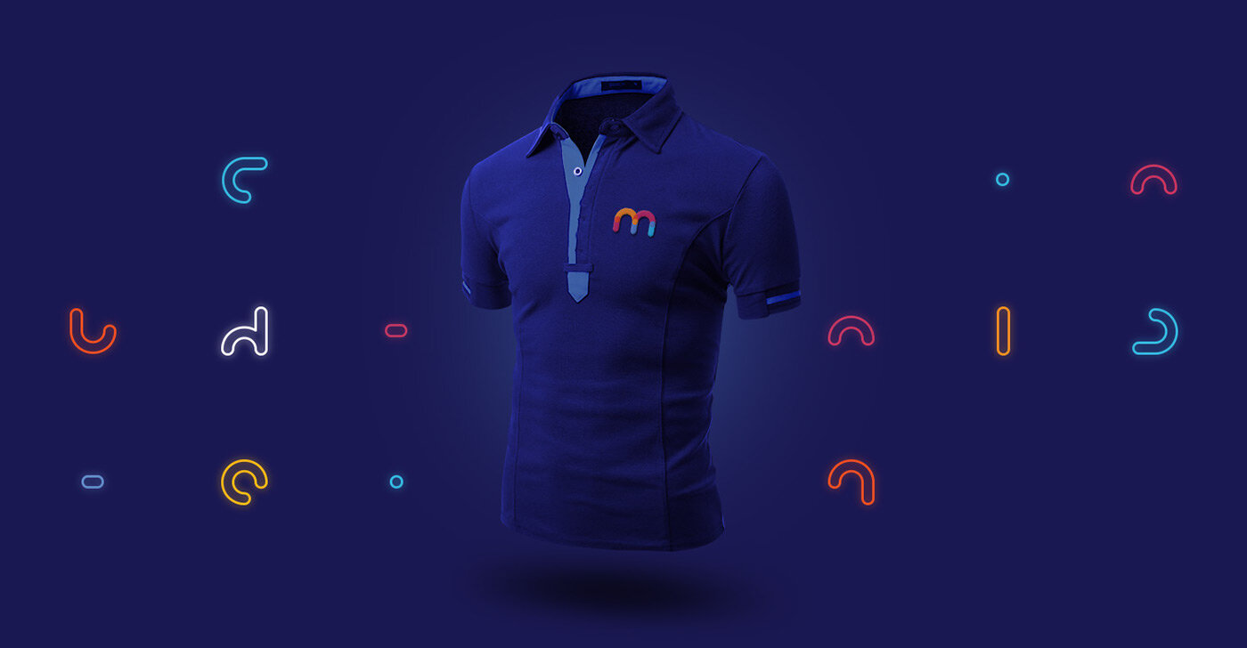
After the design thinking and sketching processes, we meticulously created a unique, custom alphabet for Medutopia, which then formed, by itself, the 100% unique, one and only Medutopia logo.
To highlight the approachable and fun personality of the brand, we preferred a geometric typographic approach with rounded edges. While creating a dynamic and playful character, we crafted the letters carefully to make sure that we maintain a good balance and refrain from making the alphabet look childish.
The Medutopia font achieved its goal to look playful and fun, but also slightly futuristic and approachable.
COVID-19 Poster / Podcast Cover Designs
“I didn’t have any clue where to get started with logo creation and brand strategy. During an exhaustive search, I repeatedly came across Ozan Karakoc Design Studio. (…) The guy is simply brilliant and he thinks of everything. Granted, there are a lot of designers out there, but finding the one who truly cares about you as a client is rarity in my opinion. Ozan cares. If you are looking for a designer to help you build your dream, this is the guy for you.”
ROB ROGERS CEO / Medutopia


