
Elevation
Home energy solutions provider Elevation is one of the fastest-growing companies in the United States with multiple Contractor of the Year awards by the Department of Energy. However, the company had a brand strategy problem: It was known for what it used to do, not for what it’s capable of.
Smart Branding for a Smart Energy Provider
Elevation offers residential energy solutions, including energy monitoring technology and energy efficiency products and services. But the market perceived the company as a solar panel installer. To rethink its positioning and unlock its full potential, Elevation hired Ozan Karakoc Design Studio.
BRAND ANALYSIS
We initiated a thorough brand analysis using our 14-point Brand Audit to assess Elevation and its competitors. With that, we identified what has worked and what has not, creating a blueprint for recalibrating the brand.
DIFFERENTIATING STRATEGY
We engaged in the Brand Strategy process, interviewing key stakeholders. We uncovered the brand’s noble purpose as changing how homeowners think about energy by informing, educating and empowering them.
EFFICIENT BRAND ARCHITECTURE
We optimized Elevation's brand portfolio through a brand architecture process to enhance marketing efficiency. The strategy culminated in evidence-based tactics to maximize communication effectiveness.

Power-Filled Visual Identity
Having discovered and crystallized Elevation's brand story, we were ready to go on to the next phase of the project: designing the new brand identity.
In the officially selected design, we highlighted the 'revolutionary' quality of the Elevation brand by creating a stylized flag symbol that also resembles the symmetrical layout of the solar panels. The upward movement suggested by the name 'Elevation' was incorporated, creating a seamless connection between the emblem and the brand name for enhanced perception.


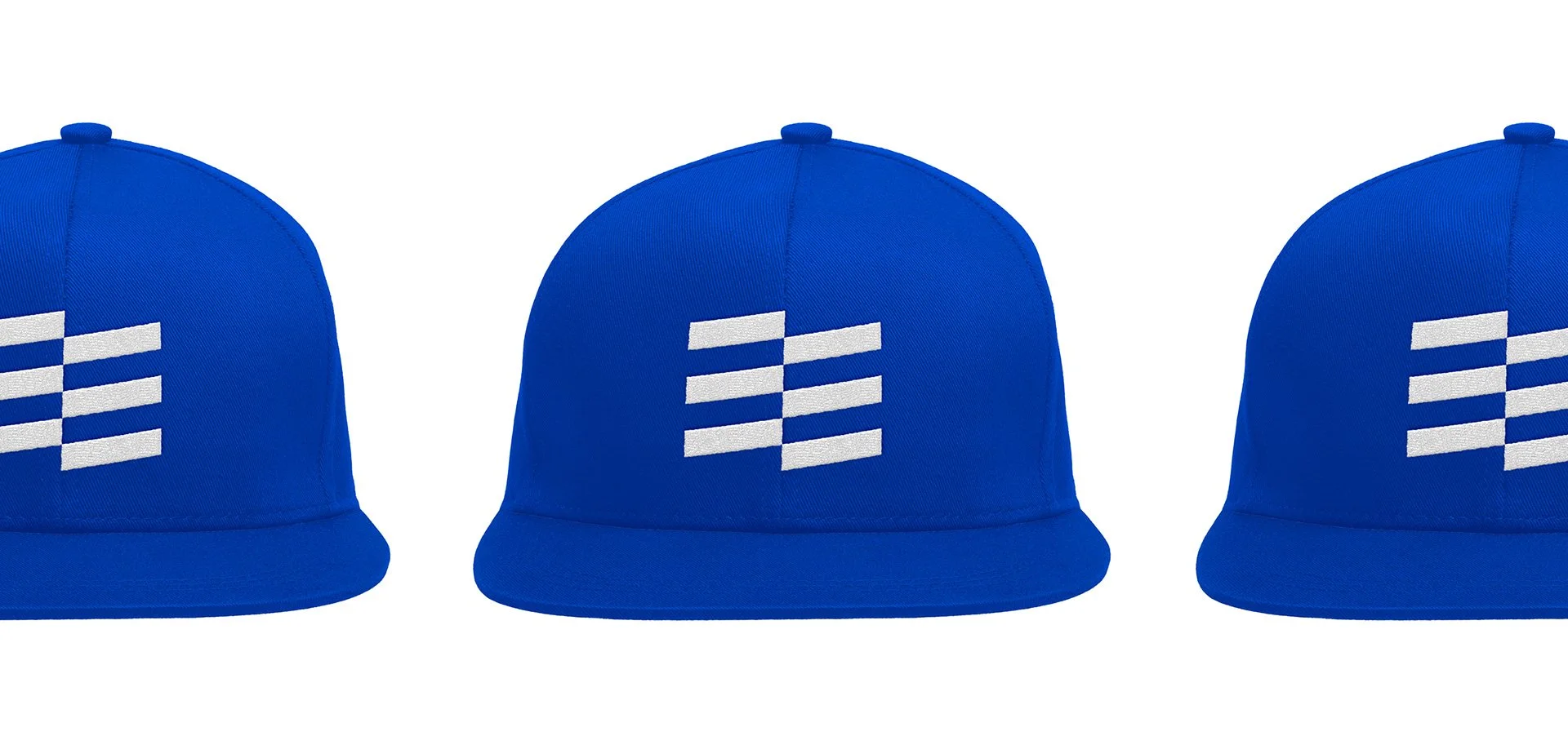
Sales Team
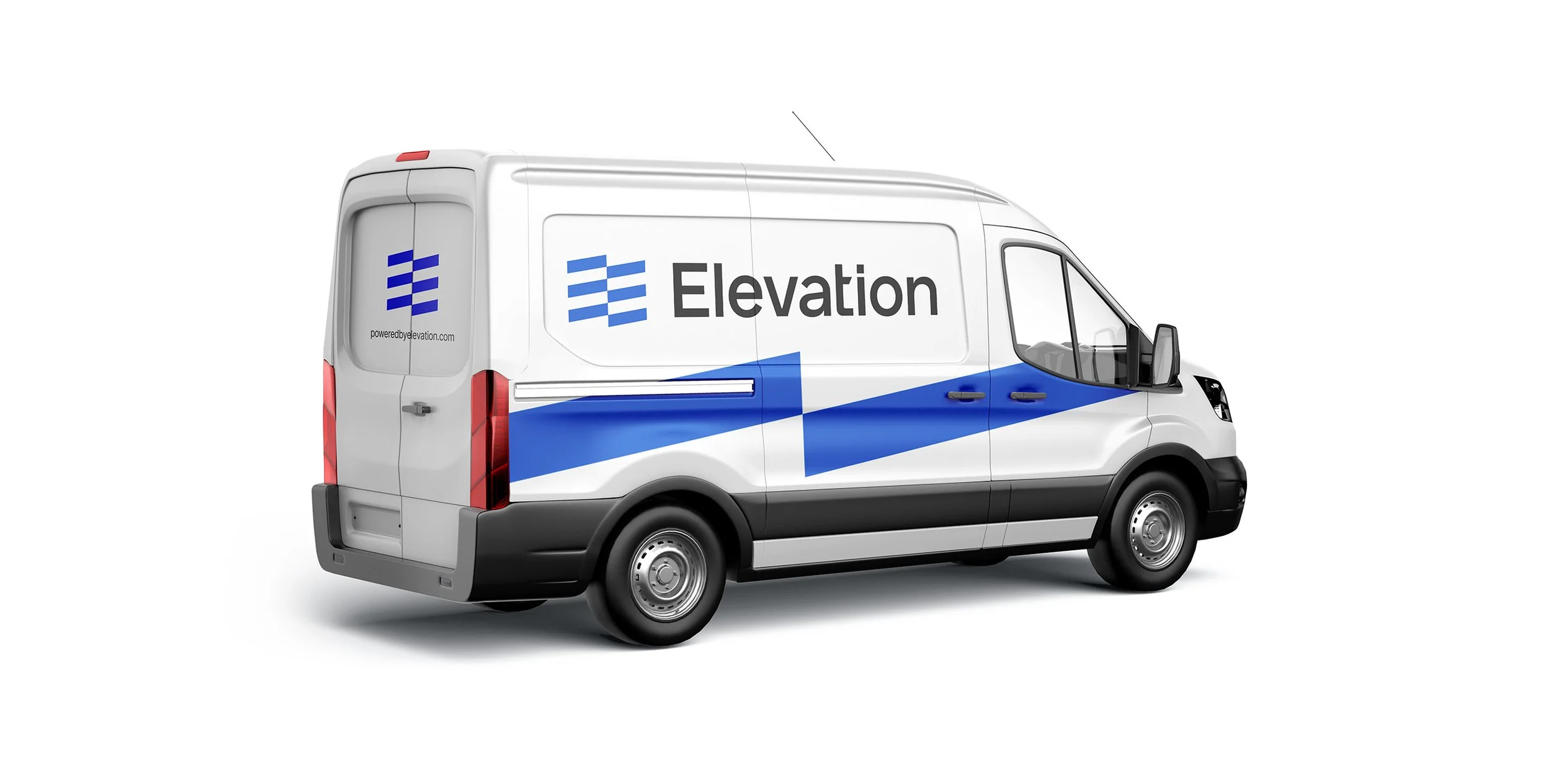
We completely changed the look and feel of the Elevation sales experience by redesigning the sales representatives' shirts, hats, ID badges, presentation materials and vehicles.


Yard Signs
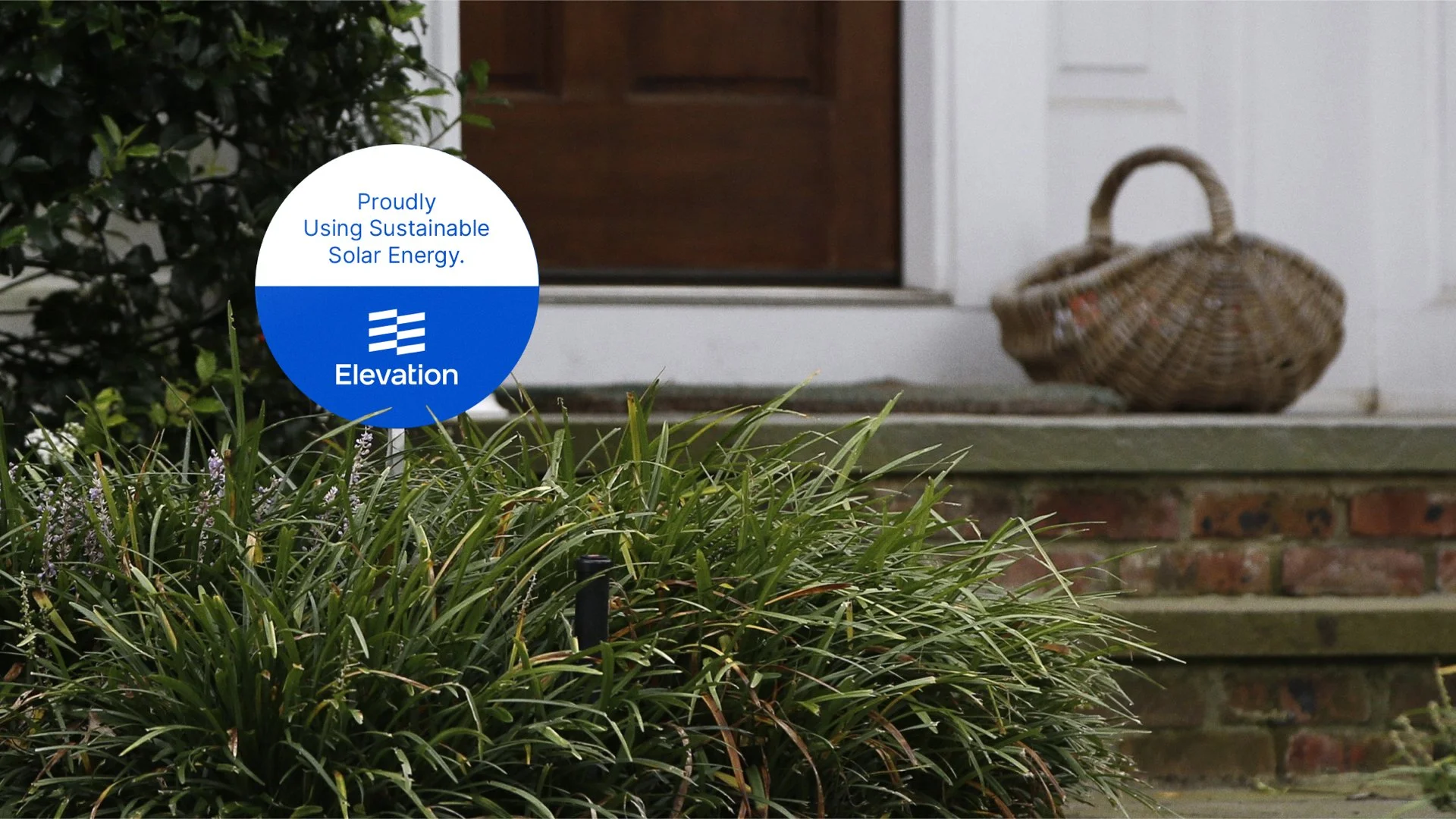
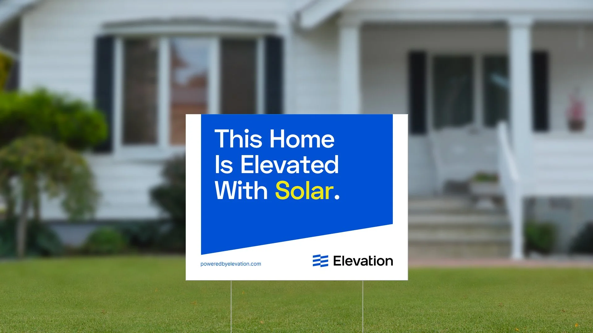
We redesigned Elevation’s yard signs to increase brand awareness and give the customers the chance to share their conscious decision on choosing a sustainable and environmentally friendly way to use their energy more efficiently.
Website
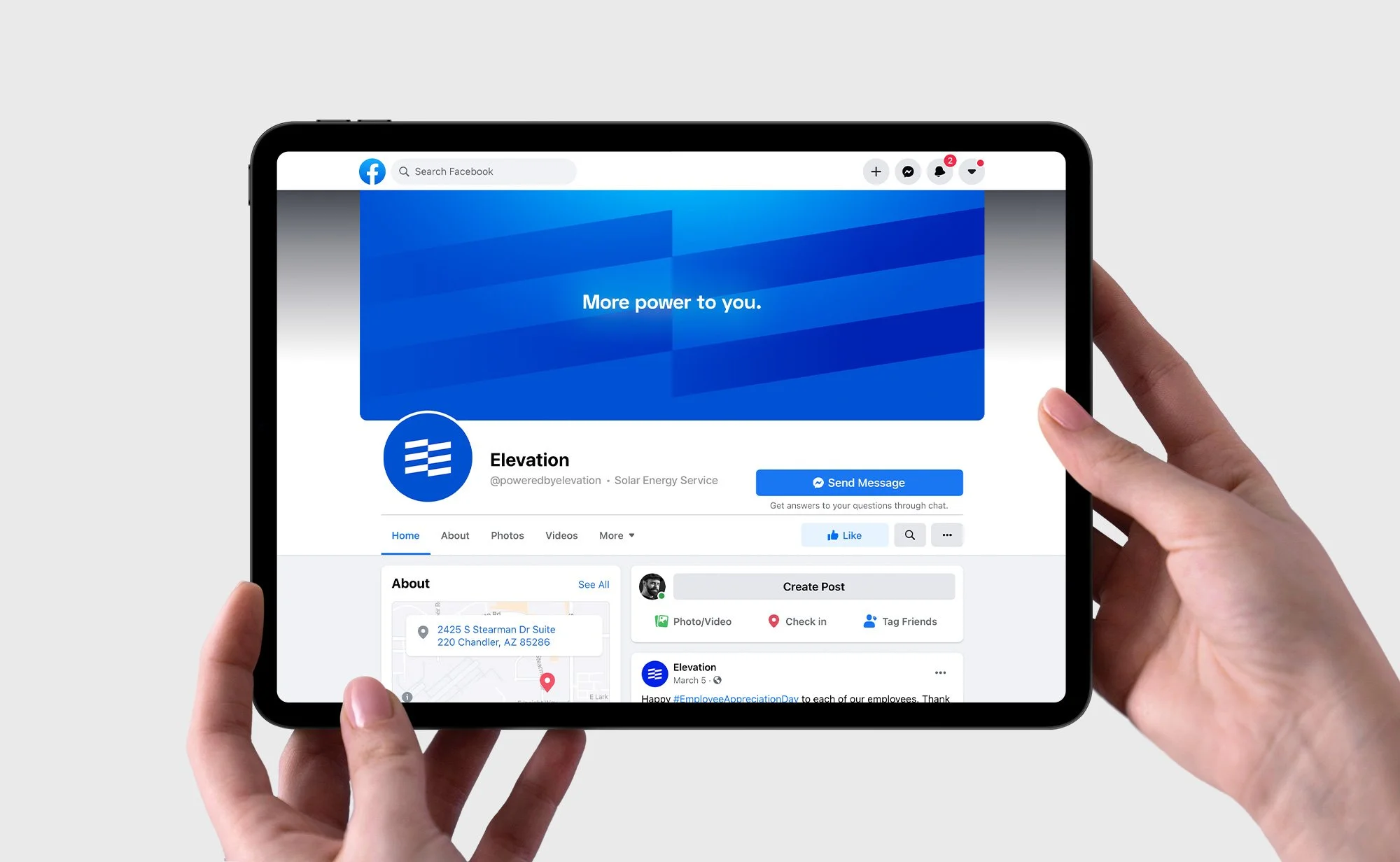
Then came the online presence of Elevation. The brand had four separate websites for different services, solar energy, energy efficiency, customer education, and Curb energy monitoring system. That was not only confusing for the viewers, but also not an efficient way of representing the brand since potential customers should have been aware of all four websites to be able to understand that Elevation is a full-service energy solution provider they can trust.
Therefore, we decided to merge all into one website, poweredbyelevation.com.

Curb
In 2020, Elevation acquired Curb Energy to add smart energy monitoring technology to its whole home solution.
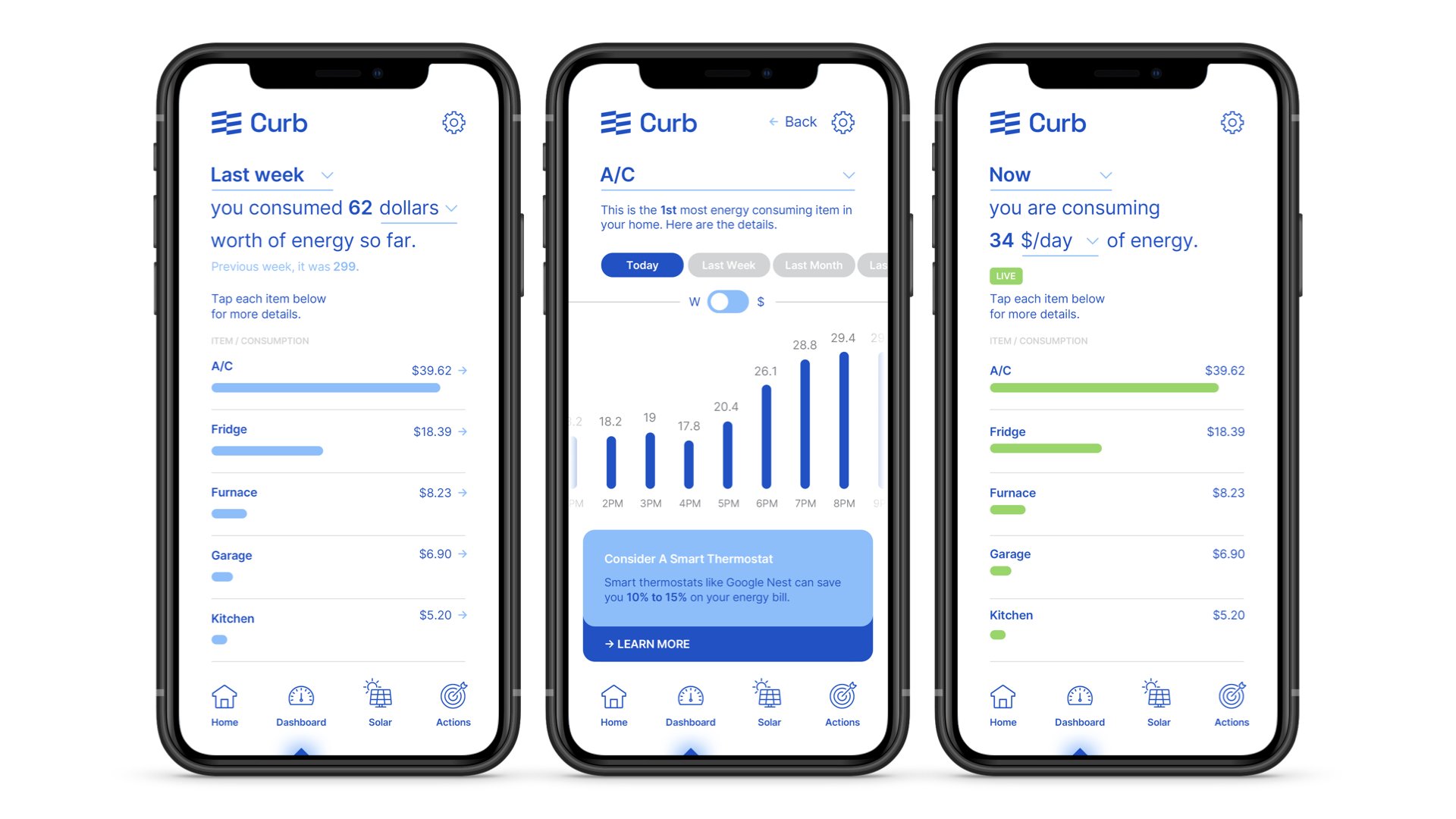
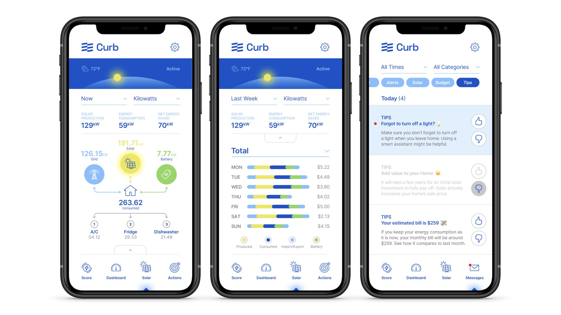
Curb connects to home's electrical system to provide the homeowners real-time data on energy consumption so that they can make smarter decisions about how they use electricity. By doing that, you understand the costs, take control of your energy bills, and eliminate wasted energy.

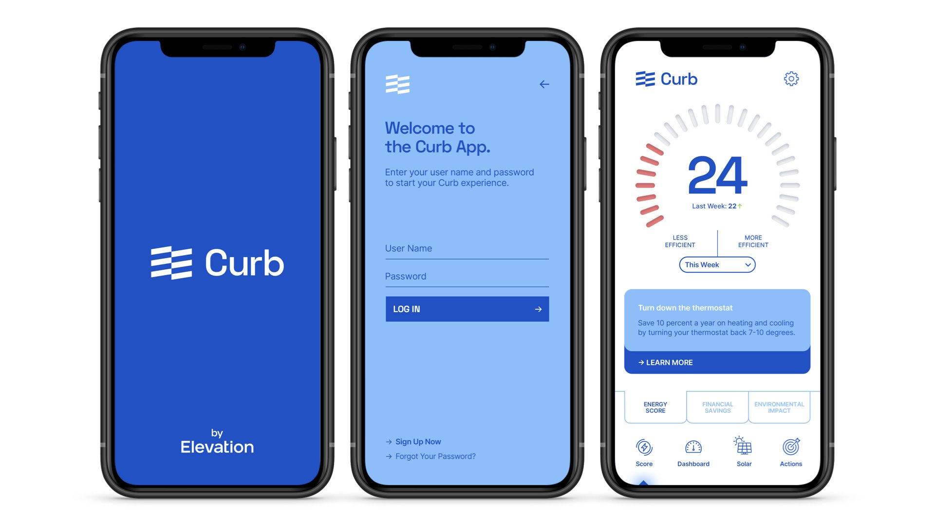
The Curb App
As we decided during our Brand Architecture process, we included Curb into the Elevation brand ecosystem, instead of leaving it as a separate entity. We designed its new logo and then rethink the entire user experience after several productive conversations with the product team.
Our goal was to create a beautifully designed, intuitive, easy-to-use Curb App experience to reduce the learning curve and help the users immediately start benefiting from it without any questions or concerns.
We designed one app for professional electricians to make the installation process hassle-free, and one app for the homeowners to easily track their energy usage.

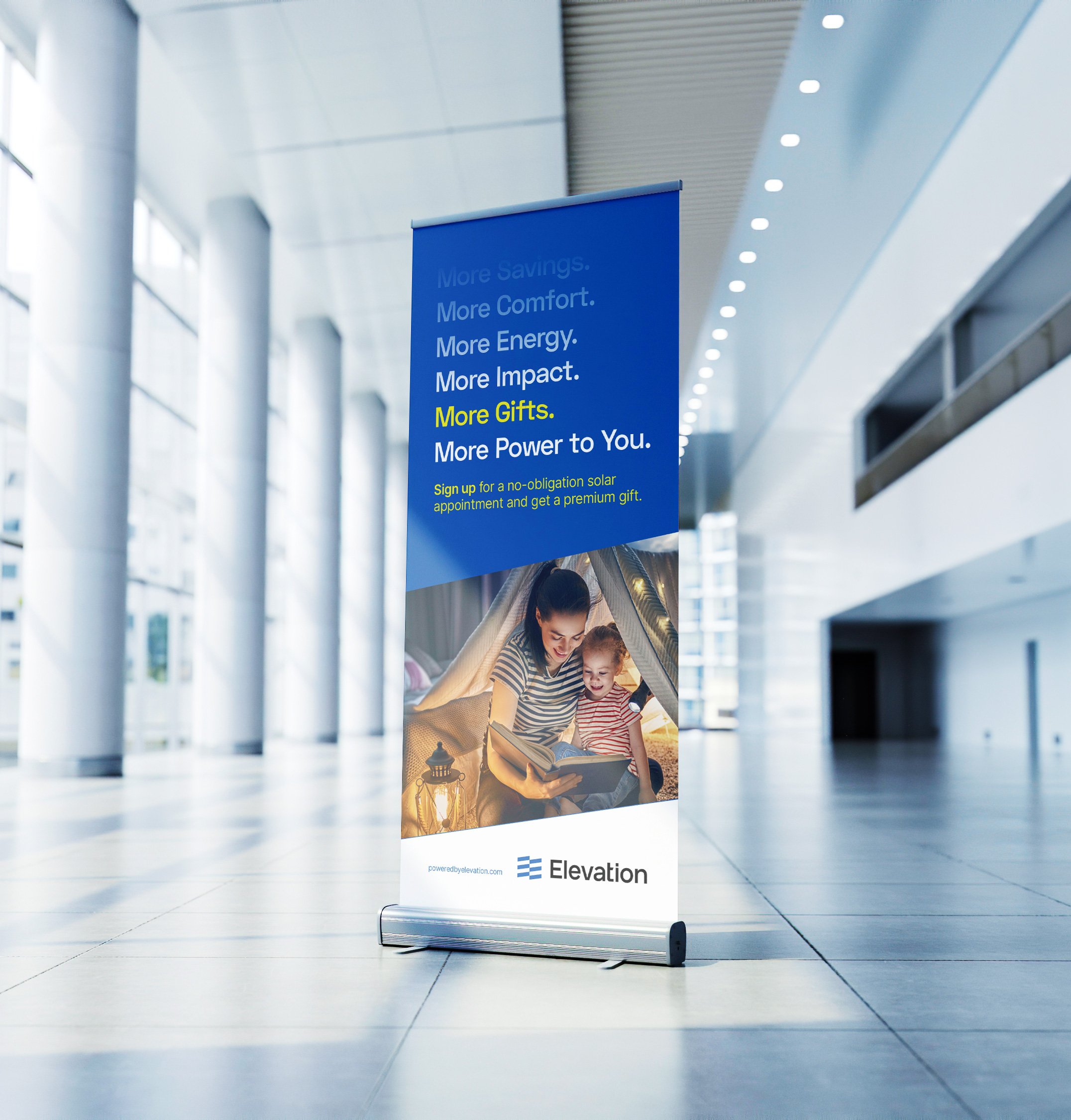
Other Elements and An Ongoing ‘Partnership’
From roll-up banners to postcards, intranet sites to newsletters, office wall mural to video chat background graphics, we've designed plenty of other elements for Elevation and we've been proudly continuing to serve their design and strategy needs.
We sincerely thank the wonderful Elevation Team for choosing us, and you for viewing this case study.
“OK’s thoughtful work and beautiful design helped us further define our identity both in visual communication and also in the culture of our company. Today, OK is our trusted brand partner and we are proud to consider it an extension of our team.”
CHRISTY SHANNON VP of Marketing / Elevation