Story
Ace Alarm is a Los Angeles based, 35-year-old security company that focuses on alarm systems. Before its rebranding approach, Ace Alarm chose to proceed as a small family business and operate like a local service provider. Their main target has always been the Korean community.
After their respected founder passed away, his son, a dedicated entrepreneur, took over the operation, decided to take his father’s heritage and bring it to a new level. From that time on, he started exploring new ways to expand the reach of Ace Alarm to the entire city, and target all communities.
He decided to start with rebranding and contacted us.
The process began with Brand Strategy. The goal was to define Ace Alarm prior to developing its brand identity. Our highly experienced brand strategy team created a Brand Platform that suggested what Ace Alarm can stand for, how it stands alone, and how it stands out.
By coming up with the brand's Purpose Statement, Brand Promise, and Brand Personality, we created a well-thought-out, meticulously crafted strategy that guided us to create the ideal brand identity for Ace Alarm.

PURPOSE STATEMENT
To help our community of ambitious entrepreneurs succeed by ensuring the safety of their investments.
BRAND PROMISE
A concierge alarm service that reduces your risk, cost, and hassle, thus giving you a peace of mind.
Once the strategy is set with the client, the design process began.
Based on the new strategic approach, we created 9 unique design options that truly represent the values and vision of Ace Alarm, and 4 of them have been shortlisted.
#1 (eagle eye) and #4 (eagle icon) were inspired by the eagle metaphor. Being able to fly higher than any other bird, eagle sees more, gets aware earlier, and protects better.
#2 was the representation of 360-degree security and total awareness of surroundings. It was a more minimalistic and contemporary approach.
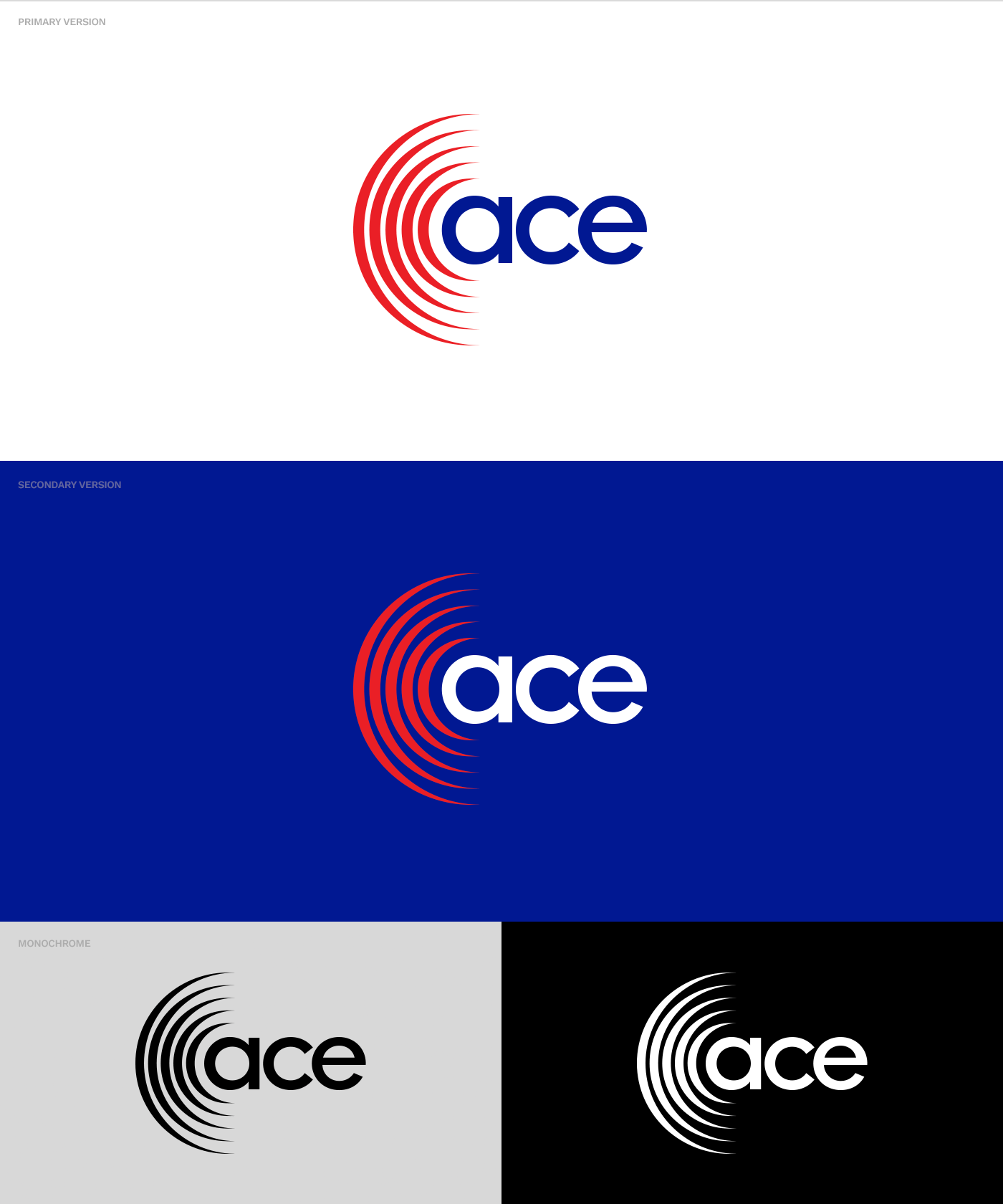
Finally, #3 highlighted the concepts of 'awareness' and 'alarm' by using the gradually growing sound waves which nest the letter A, and the word Ace.
Choosing one of the four finalist logos was the only hardship the client experienced during the time we worked together. At the end, they decided to move forward with #3.
Now that the logo has been officially selected, it was time to set guidelines to ensure the consistent use of it by all parties, from in-house teams to 3rd party vendors like printers, event organizers and sponsors.
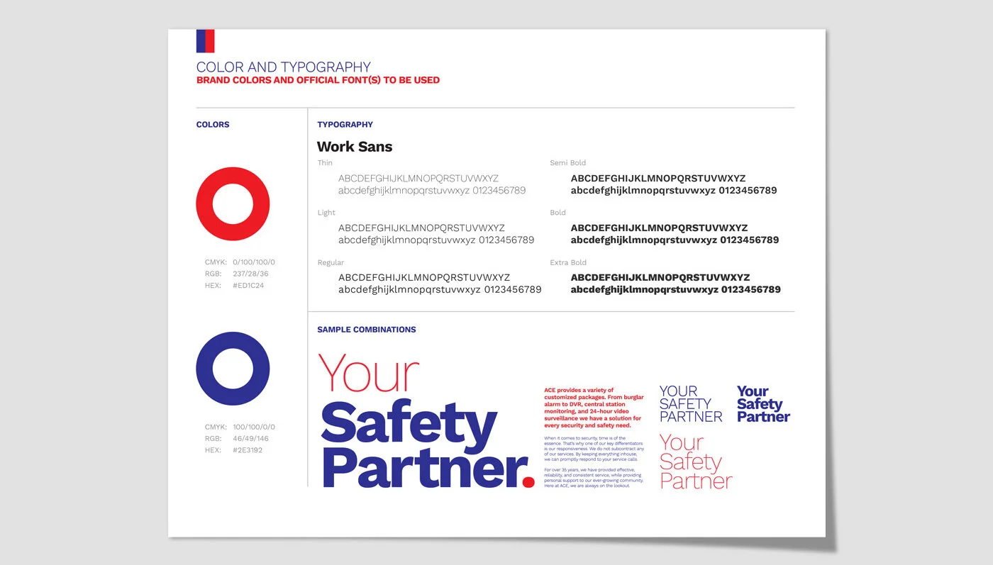
We created a 12-page Brand Style Guide to set the rules for Ace Alarm's new branding. The document includes logo lock-ups, tagline usage, color schemes, typography guidelines, and more...
Then… The stationery…
The new Ace logo can easily be applied on different type of materials, from paper to fabric, metal surfaces to brick walls.
One of the important customer touchpoints for Ace Alarm is its yard signs. Every property that is protected by Ace Alarm places a sign on their front yards, doors or windows. Unlike most of their competitors' signs (including their previous design), we didn't use hexagon or octagon, but chose to use a round shape for a simpler, more modern look, and to complement the curvy waves in the logo.
Ace Alarm vehicle is another important opportunity for the brand to create more awareness and increase visibility. We came up with a bold and simple design that easily stands out in the streets, and among competitors.
We also created a printed 4-page brochure for Ace to hand out to potential and existing clients. It briefly tells who Ace is, what it stands for, how it is different, and what their services are.
“I had the pleasure of working with Ozan Karakoc Design Studio in rebranding our 35-year-old business and transitioning it into the 21st century. Ozan and his team were extremely helpful from start to finish. Ozan helped put together the missing strategy piece of Ace Alarm and helped construct a story that showcases our brand. I trusted my 35+ year business to him, and I highly recommend that you consider Ozan for your business as well.”
JAMES CHANG CEO / Ace Alarm


